

The Color of Safety
From Birren to OSHA, in reality and on-screen, how does pigment play a role in protecting workers from harm and making mistakes?


A few weeks ago, I got nerdsniped by a Beth Mathews essay, Why So Many Control Rooms Were Seafoam Green. It introduced me to the story of Faber Birren, responsible for the characteristic color schemes we associate with mid-century industrial interiors. More generally, Birren pioneered the use of color as a design and control variable shaping everything from consumer buying behaviors to emergency response behaviors.
Color is especially interesting as an element of Protocol Experience (PX) design, since humans are especially sensitive to color. And color, especially in the form of paint, is a cheap design variable, ideal for persistent, configurational uses. You don’t need electricity to generate a default color scheme. Ambient broad-spectrum illumination (natural or artificial) is enough. And when you do use powered color for dynamic signaling, it is still robust and inexpensive to generate, especially today, with the rise of low-power LED lighting and screens.
Color and Control
Reading Mathews’ article, as a sometime practicing control engineer, I was struck by the realization that though I’ve spent a lot of time thinking about command and control architectures, systems, and protocols, including control rooms, I’ve never thought about color as a particularly important consideration in control engineering, either in theory, or practice.
I’d never noticed that mid-century control rooms have a characteristic sea-foam green color.
When I’ve designed things like dashboards, color has been an afterthought, and I’ve usually done something lazy like code “significant” as “red.”
Yet, color is obviously one of the most powerful design elements available to control system engineers and protocol architects, especially when it comes to human-in-the-loop environments. But engineers don’t study it. Textbooks don’t teach color science. Even history books like David Mindell’s excellent Between Human and Machine: Feedback, Control, and Computing, don’t cover the role of color in command and control.
One reason of course is that color is not easy to use in automated feedback loops, and other kinds of signals are much easier to work with. Detecting and reacting to color-coded signals typically takes cameras attached to significant computing power. In control design, it is much easier to work with electrical or mechanical signals from more specialized sensors.
But when there are humans in the loop, color is a natural and cheap signaling variable. It still doesn’t play a big role though.
The reason is that the human-centeredness of color leads to its neglect in control engineering. Humans, unlike op-amps or microcontrollers, are flaky, temperamental, and unreliable engineering components. Components of last resort when architecting for reliability.
When humans must be integrated into a protocol that generates reliably repeatable behavior, it takes significant investment in training to get them to behave in sufficiently machinic ways. We had to invent an entire subculture of “professionalism” to teach and sustain reliable human behavior. And even then, color is never just functional for humans. It is invariably also an element of aesthetic experience, psychological comfort, and narrative commitment. In control engineering terms, color is an exceptionally noisy signal when processed by human brains.
So it makes sense that control engineers and protocol architects largely washed their hands of color, and learned to work around it. It became the preserve of designers and psychologists.
Palettes and Protocols
The Birren palette was designed to be a functional color-coding language for safety-first interiors, and meant to be comfortable to inhabit for extended working hours. It was the 1950s visual equivalent of elevator music plus the dings/bells/alarm sounds an elevator is capable of producing.
In 2025 though, Birren-colored interiors evoke mid-century nostalgia. The Birren palette has unavoidable aesthetic-narrative connotations today that were likely never intended. It is the palette of Golden Age science fiction. Of Competent Men doing Professional Things.
This is not what industrial interiors of more recent construction look like though (hence the nostalgic appeal of the Birren palette). And it turns out there’s a fascinating story there about how the relationship between color and industrial safety has evolved, which I was able to unpack with help from ChatGPT.
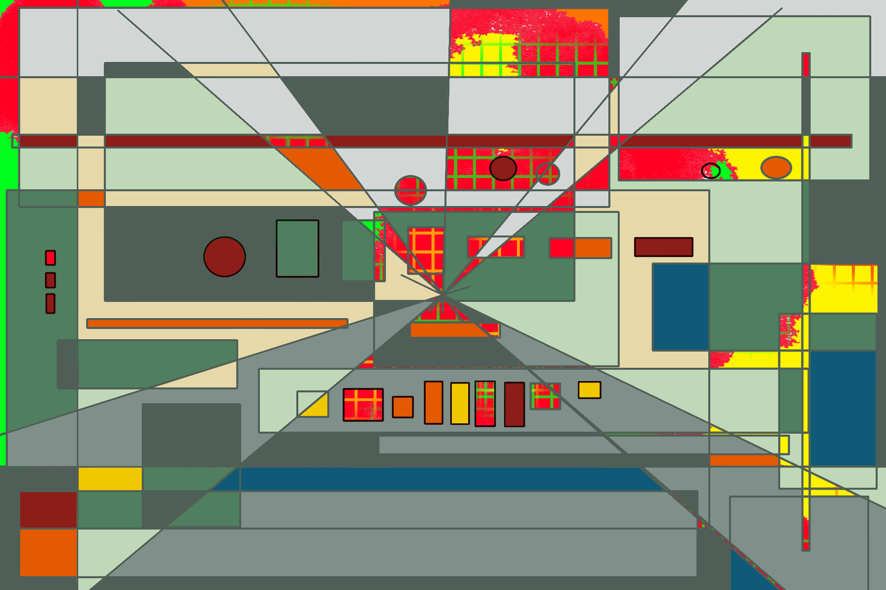
That’s not what I set out to do though. I started out simply wanting to make some nostalgia-aesthetic digital art using the Birren color palette, with a view to possibly training an image model on it with TITLES. Here is my first attempt. I aim to make about 30 such paintings, and then train a model I’ll name Birren. This one is a sort of abstract industrial interior where a Birren-palette foreground partially masks lurking fire risks.
I wanted a stable swatch of colors to make such paintings. So just for fun, and partly to flatter my own conceits about possessing some rusty Color Science 101 knowledge from when I started my first job at Xerox two decades ago, I began by asking ChatGPT to transform the old magazine scan from Mathews’ article into an approximate color-corrected swatch for me to use in my painting program, taking into account the gamut distortions in scanning a faded old magazine article.
Here, if you’re curious, are the palette as shared by Mathews (leftmost) and the one reconstructed by ChatGPT (middle and right).
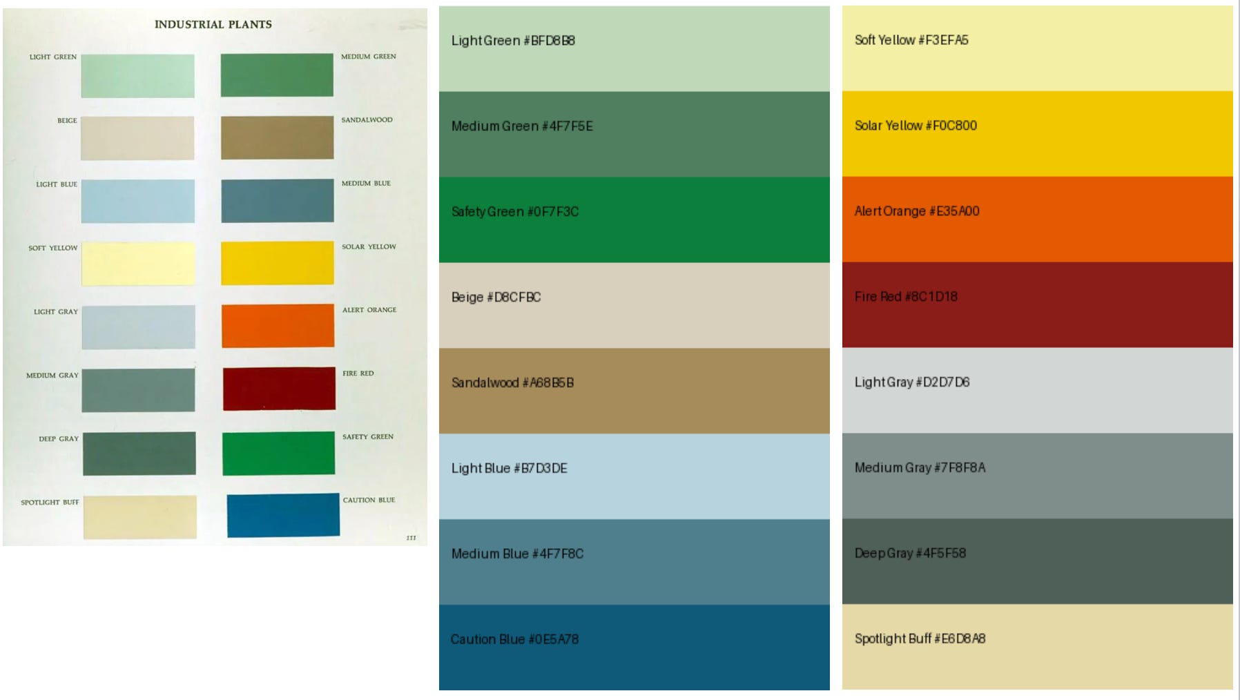
The practical reasons for doing this are to have a uniform patch of color to sample with the dropper tool in painting programs, and to attempt to undo the color-shifting effects of scanning, printing, and aging in the scan.
As it turns out, Birren color schemes are pretty forgiving. They’re not defined with the precision of Pantone spot colors, but in terms of ranges that respect a particular visual logic and grammar. They are also designed to work within the capabilities of paints available in Birren’s era (the 1950s). For instance, fluoroscent paints, which play a big role today in the color of safety, were not available then.
In the process of making these swatches, thanks to some passing comments by ChatGPT, I discovered that there’s a lot more to the story. The entire philosophy of how to use color as part of a safety strategy has changed. The Birren-style philosophy of safety protocols has been replaced by a different one, best represented in the US by color-coding practices associated with the Occupational Safety and Health Administration (OSHA).
I had ChatGPT explain this evolution to me, and then write an essay summarizing our conversation. The next few sections were primarily written by ChatGPT, with light edits and additions by me. Comments and corrections from better-informed color scientists and industrial interior designers welcome.
The Origins of Industrial Colors
Color in industrial and architectural space has never been merely aesthetic. It organizes attention, encodes danger, regulates bodily comfort, and quietly trains perception over time. Yet, contemporary designers rarely get an opportunity to think about these matters. They most often encounter industrial color schemes through regulatory tables and compliance charts – reds, yellows, greens assigned to predefined meanings and applied late in the design process.
This way of thinking about color is historically recent. In the mid-twentieth century, figures such as Faber Birren approached color not as a signaling layer but as a fundamental component of environmental design. The evolution from Birren’s approach to the standardized safety regimes later enforced by OSHA reflects deeper changes in psychology, materials, labor assumptions, and philosophies of risk.
Birren worked at a moment when industrial modernity had reached a form of equilibrium. Factories, offices, schools, and hospitals were places where people expected to spend years, often entire careers. His foundational assumption was that color must support sustained human presence. Color planning, in his view, was neither decorative nor symbolic in isolation. It was infrastructural. Interiors were visual systems whose brightness, contrast, and chromatic intensity had to be regulated as carefully as acoustics or lighting. A well-designed color environment would quietly reduce fatigue, increase accuracy, and make moments of danger perceptually unmistakable without constant visual noise.
Central to Birren’s thinking was the primacy of value, or lightness. He believed that the eye organizes space first by brightness before it attends to hue or saturation. As a result, Birren-style interiors followed a strict value hierarchy. Ceilings were lightest, maximizing reflected light and reducing glare. Walls were slightly darker, providing a calm, continuous field. Floors and machinery occupied middle values that grounded the space visually. Crucially, the most serious hazards and stop conditions were rendered darker still. Fire equipment, for example, was often painted in deep, low-value reds rather than bright scarlets. Darkness carried weight. It signaled seriousness and finality in a way that brightness could not.
This hierarchy was not meant to be consciously decoded. Over time, workers learned it implicitly. The environment trained perception. A glance was enough to tell what mattered, not because the colors were loud, but because they were rare and carefully positioned within an ordered field.
Birren was equally deliberate about chroma. He treated saturation as a physiological variable rather than an expressive one. Large areas of high chroma were avoided because they increased visual fatigue and rapidly lost their signaling power through habituation. Most continuously viewed surfaces were kept at low to moderate chroma, allowing the eye to rest. Higher chroma was permitted only in small, localized areas where interruption was genuinely required. In this sense, Birren’s environments relied on restraint. Color worked because it was not constantly demanding attention.
Neutral grays played an especially important role in this system. Far from being generic leftovers, grays functioned as active regulators of brightness and contrast. They reduced glare from machinery, stabilized visual fields, and framed colored elements so that those elements retained meaning.
Without gray, Birren’s system would collapse. It was the quiet scaffolding that allowed color to function precisely.
Birren’s philosophy was shaped not only by psychology but by material reality. The paints available during his career were chemically and optically limited. Fluorescent pigments did not yet exist, chroma ceilings were lower, and saturation stability over time was imperfect. Color thinking was grounded in reflectance rather than emission. The Munsell color system, with its explicit separation of hue, value, and chroma, aligned naturally with this worldview. Designers thought in terms of perceptual relationships rather than device outputs or symbolic codes. These technical constraints reinforced Birren’s emphasis on value hierarchy and chroma restraint.
From Contexts to Signals
By the late 1960s and early 1970s, however, the social and industrial context that supported Birren’s approach began to dissolve. Workforces became more transient, automation increased, and regulatory and legal pressures intensified. Spaces were no longer designed primarily for long-term inhabitation by stable populations. Instead, they had to function for visitors, contractors, inspectors, and emergency responders who might encounter them only briefly and under stress. In this new context, color systems based on gradual perceptual learning appeared inadequate.
Additionally, the rise of automation meant color was no longer as critical, since fewer humans were persistently present in industrial interiors, and automated systems typically used signals other than color to run themselves. The retreat of color foreshadows, in some ways, the modern rise of dark industrial interiors, ranging from dark data centers to metaphorical dark kitchens.
The rise of OSHA-style safety color reflects this shift. Modern safety color treats color not as part of an environmental context but as a discrete and exceptional signaling system. The goal is immediate recognition rather than long-term coherence. Red means fire or stop, yellow means caution, green means safety, and blue means notice. These meanings are fixed, explicit, and standardized across industries. The system assumes distraction, cognitive load, and urgency. It is designed to function even when the surrounding environment is chaotic.
This philosophical shift is visible most clearly in how value is treated. OSHA does not define a value hierarchy. In practice, safety colors are often high in both value and chroma. Bright yellow hazard markings, vivid red fire equipment, and intense green safety signs frequently sit against white or very light walls. Multiple elements compete at similar brightness levels, flattening perceptual ranking. Where Birren used darkness to convey seriousness, OSHA uses brightness to demand attention.
Here is an example of OSHA style colors, in the form of a catalog of safety tapes of various sorts.

The widespread availability of fluorescent pigments intensified this trend. Fluorescent paints emit light as well as reflect it, making them highly visible in poor lighting and at long distances. From a signaling perspective, this is a clear advantage. From an environmental perspective, it is destabilizing. Fluorescent colors dominate surrounding surfaces, erode subtle value relationships, and accelerate visual fatigue. As more signals become bright, designers add still brighter signals, producing a cycle of escalation. The result is environments that are visually loud even when nothing is happening.
Two Philosophies of Safety (and Color)
At a deeper level, Birren and OSHA embody two distinct theories of safety. Birren’s approach assumes that safety emerges from order. A calm, legible environment makes danger perceptually obvious because danger is rare and visually distinct. OSHA’s approach assumes that danger must be unmistakable even in disorder. Safety is achieved through explicit alarms that override context. One system relies on learned visual grammar; the other relies on categorical symbols.
Birren is about high context environments. OSHA is about verbose signaling environments.
These approaches produce markedly different experiences. Birren-style environments tend to feel coherent and calm, supporting long periods of focused work with relatively low fatigue. They work best where people have time to learn the space and internalize its logic. OSHA-dominant environments, by contrast, are optimized for immediacy. They function well for short-term occupants and emergencies but often produce visual clutter and desensitization over time. When everything is bright and urgent, urgency loses meaning.
Most contemporary industrial and institutional spaces are hybrids of these two systems. Birren-like backgrounds coexist with OSHA-style overlays. The result is often perceptual tension rather than balance. Value hierarchies are partially established and then violated. The eye receives conflicting instructions about what matters. This is why many modern interiors feel subtly exhausting even when they are technically compliant.
For design students, the lesson is not to choose Birren over OSHA or vice versa. The lesson is to recognize that color systems encode assumptions about people, time, risk, and responsibility. Before choosing colors, one must ask whether a space is meant for dwelling or for passage, whether safety is learned or instantaneous, whether fatigue or distraction is the dominant risk. Birren’s approach fails if applied uncritically today, just as OSHA’s approach fails when spread indiscriminately across entire environments.
Color is philosophy made visible. The transition from Birren’s visual ecology to OSHA’s signal saturation mirrors a broader cultural shift from spaces designed for inhabitation to systems designed for risk management. Understanding this history allows designers to use color deliberately rather than inherit it accidentally. The palette is never neutral. It expresses a theory of how people relate to space, danger, and each other.
Cameras, AI and the Return of Color
Thank you ChatGPT, back to me.
The retreat of color that started in the 1970s has now reached its nadir in the form of dark industrial interiors, where visible-spectrum elements are largely irrelevant (infrared though still matters).
But there’s a counter-trend underway: the rise of AI and robotics have created a strong drive towards camera-based infrastructures, and even camera-only infrastructures. In robotics, for example, one school of thought holds that cameras are all you need. That you can even dispense with things like angle sensors or rotary encoders if you have enough cameras. In the self-driving car industry, Tesla famously holds that lidars (which rely on infrared) are unnecessary. If biological organisms can self-drive using vision alone, so can cars.
Of course, you cannot entirely eliminate all other sensors. Sound is clearly almost as important as vision even for us highly visual primates. And all mammals have the equivalent of accelerometers in their ears. So it is no surprise that phones and robots typically feature microphones and accelerometers as well. But, to a first approximation, cameras are eating the world’s sensors, and will demand a return to a more colorful world.
Cameras are surprisingly powerful sensors because almost everything that might matter for feedback in a controlled environment either has a natural visual component, or can be rendered visible at low cost (for example, introducing a colorant in invisible dangerous gases or clear liquids). Just as the smartphone has replaced many personal devices, the camera can replace dozens of different sensors.
The cost though, is the need for intelligence. You need an AI, or ideally, a robot to interpret and react to color (and visual fields in general).
And when color communicates safety, and is linked to behaviors that must unfold extremely rapidly, you have a major challenge for future designers and architects.
What should the color of safety be in the age of AI? How will be paint industrial interiors when the primary inhabitants are camera-driven intelligent machines, ranging from robots to appliance-like machines, to background smart-environment features?
The designer – or AI – who figures out the answers will enter the history books alongside Birren and his late-industrial successors.
Coda: The Color of Safety On Screen
Since the color of safety is rarely fully visible unless there is an active emergency unfolding, and because industrial interiors are not particularly accessible anyway, it is not an easy observation target for protocol watching1 enthusiasts.
Fortunately, it also happens to be a favored topic in screen media. It is fascinating to pay attention to the color of safety in movies and television, especially over time (obviously, this is only possible past the black and white era).
The wave of disaster movies from the early 1970s, including such cult classics as The Towering Inferno and The Poseidon Adventure, showcase Birren-like safety environments at their peak. The build-up of tension has an uneasy background-dominant vibe of terror to it. The characters seem to inhabit their environments much more mindfully. Plots seem much more atmospheric and suspenseful.
By contrast, modern disaster thrillers are much more likely to feature bright flashing lights and loud alarms – and characters who don’t really attend to their environments until things start going wrong. Thrilling foreground excitement tends to replace ominous background build-up of terror. Plots are action-packed rather than suspenseful.
As storytellers adapt to the age of AI, we can expect to see the color of safety reshape human narratives yet again. And us protocol-watchers will have a whole new crop of movies and TV shows to watch, and a new color-of-safety language to decipher.
Protocol Watching is a hobby we are trying to foster here at Protocolized. If you’re interested in joining other protocol-watching enthusiasts, join our Discord and check out the #protocol-watch channel.